Web design isn’t just about making your website look aesthetically pleasing. It’s true — companies with a visually appealing websites tend to get more clicks and higher conversion rates. But there’s always more to the well-converting website than a pretty layout. It has to be easy to navigate, quick to load, and be accessible to everyone. On top of that, it must be able to create an emotional connection with the customer. When all the elements are in sync, the user is more likely to stick around and become a loyal customer.
As many as 50% of customers confess that a company’s website design plays a big role in how they perceive the brand. This points to the need for businesses to prioritize designing their websites in a way that helps them strengthen their brand identity and retain existing customers. To stay on top of your customer service game, evaluate the following aspects and consider improving them.
1. The organization of the content
A typical website visitor is likely to skim through most of the content and land on one or two things that caught his eye. This is why it’s your job to make sure that every piece of information is neatly organized so that the potential customer doesn’t became distracted by the less relevant content.
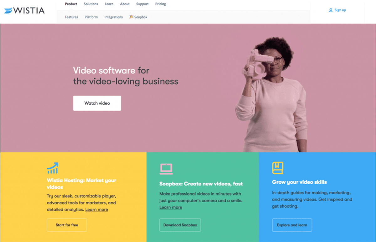
To achieve that level of organization, you have to structure your content accordingly. Whether it’s putting all the relevant information on the home page and leaving out details or dividing content into blocks, do your best to help the user comprehend the information better. Take a look at how the video platform Wistia arranged the different sections of the website for visitors to refer to without getting lost in big chunks of information.

2. The ease of navigation
There’s arguably nothing more important than making it easy for customers to effortlessly navigate through your website. When it’s clear what button a user has to click to make the purchase or read about the ingredients of the product he’s interested in buying, the chances of him bouncing off the website get low. He’s then more likely to stay on the website for longer and remain satisfied with the site’s usability.
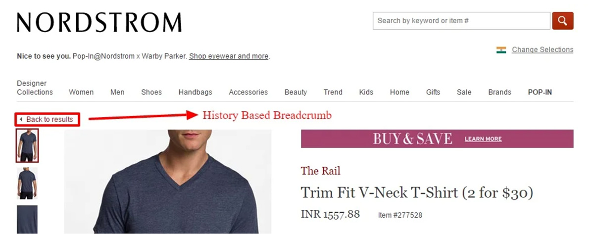
Companies usually resort to one of the two navigation styles: drop-down menu or breadcrumb. The drop-down menu is quite self-explanatory — the user has to hover his cursor over the menu to get a list of clickable titles. With the breadcrumb navigation, the user gets to click on the page he was previously thanks to the website automatically adding it to the navigation bar.
Take it from Nordstrom who did it well with their history-based breadcrumb navigation that lets the customer get back to the page he previously visited.

3. Load time
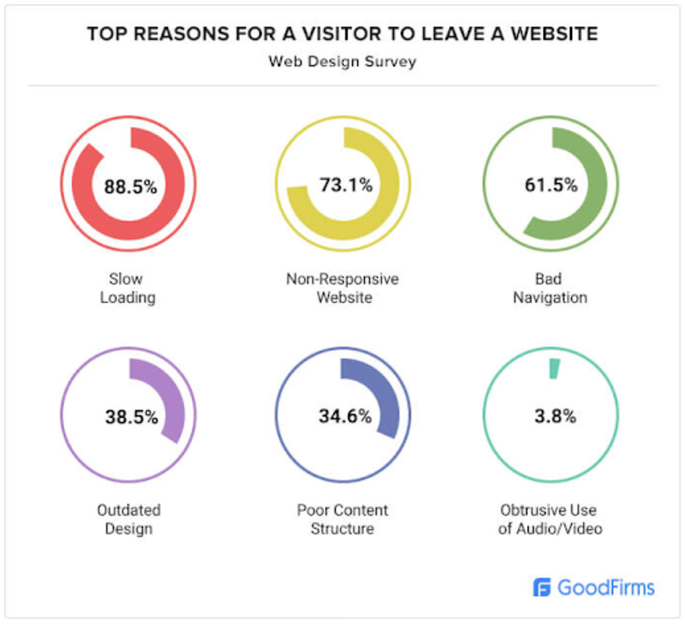
Forget about happy customers if your website takes ages to load. You might be doing everything else right, but if the user has to wait half a minute for the site to load, he’ll quickly close it and never come back again.

To put it into perspective, 47% of website visitors expect a desktop site to load in under 2 seconds. This means that hefty images along with multimedia have to fully load with the rest of the website in a few seconds too.
To reduce the loading time of your site — and appeal to Google’s ever-demanding SEO-based requirements — it’s in your best interests to optimize the image sizes, remove lengthy videos that hinder your site’s load speed, and make your website easily and quickly accessible to users on their smartphones. It also pays to use as much white space as possible so that every corner of the webpage is filled with useful content.
4. Emotional connection
A professional-looking website featuring high-quality images and modern design elements goes a long way in giving the user a good amount of credibility. But the key to building customer trust and winning him over is to create an emotional connection from the get-go. We’re talking about creating a story around your brand that would resonate with website visitors on a deeper level.
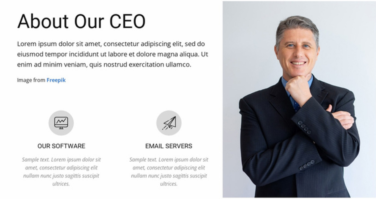
To take it a step further, include the photos of real humans on your ‘About’ page; featuring employees in behind-the-scenes content helps build the connection too.

5. Social media access
Multi-channel customer service is trending for a good reason — people like to have options. With an average internet user having 5.54 social media accounts, it becomes clear why companies have to maintain an online presence beyond a website. If you want to be a step ahead of your competitors, make sure that your website has a footer with social media buttons prominently displayed there. This way, your customers will be able to reach you via their preferred channel.
Create an impact with your web design
Now that you have a better idea about what your customers are expecting from your website, you can go ahead and start making incremental changes that will pay off sooner than later. Focus on both the visual and the practical side of the website so that the users don’t have to wait for the site to load or find it difficult to navigate amid the disorganized informational chaos.

Mikkel Andreassen
Customer Experience Manager at Dixa
Mikkel is passionate about customer experience in every color of the beautiful customer engagement spectrum. He loves building great connections with his customers, which often lead to meaningful friendships that last a lifetime and inspire his work. Driven by the genuine belief that CX is the pivotal force that drives a successful business, he is currently at the helm of Dixa’s customer experience strategy.

